So “Meet Again” is a bit of a misnomer since I use my Zune everyday but each time an update comes out it always feels like I’m relearning the Zune all over again. This time it’s the Zune 2.5 Spring 2008 Update and like every previous update I have a love/hate relationship with it.
The Love
This is an interesting update because they’ve actually added a ton of new features but they’re not all immediately obvious. The feature that jumps out the most is the new video section in the marketplace which currently has TV episode purchases but I’m assuming will eventually expand to include movie rentals and purchases. This helps bring the Zune in line with iTunes and the XBox’s version of the Marketplace and really helps round out the media experience.
They’ve listened to the community because some of the most demanded features are there, namely auto-playlists, gapless playback and browsing by genre. They’ve also really started taking the whole “Social” more seriously since you can finally view ZuneCards inside the software and get directly to your friend’s (and their friends) play list. I’d love to see these ideas explored even more, perhaps creating an API that allows you to import your play information from other players and the ability to create custom playlists that can be featured on your ZuneCard.
Another big area that has been improved that’s not immediately obvious is metadata editing. The amount of editing allowed before was so limited as to not exist whereas now they have a solid story in place that allows full editing as well as album info lookup with 800×800 album art. Metadata is near and dear to me so I’ve used almost everything out there to edit with and I’d say the user experience is up there in the Top 5.
Of course there are still a few issues with it, for example I have Fischerspooner’s ‘Danse En France‘ maxi-single and while I can easily find it in the Marketplace the ‘Find album info’ command comes back with everything else but the right album and that happens more often then I’d like. Also it’s easy to get a 100+ result set back and there aren’t any good tools to narrowing that down.
There are quite a few little UI adjustments as well; different font sizes, album art is now displayed next to progress bar, the ‘Now playing’ allows you to always hide the track listing, there is a nice “Save as playlist” option when viewing your now playing queue, and a ton of other great little additions.
The Hate
Perhaps ‘Hate’ is too strong a word but there are still some quirky things about the Zune that frustrate me. My biggest one is that you can’t use the device when it’s connected to your computer. There is a whole laundry list of frustrations on that front:
- You can’t play music directly off your Zune, you have to copy it off first.
- You can’t copy a playlist off the Zune.
- You can’t copy a podcast off the Zune.
What’s ironic is that if the reason you can’t play directly from the device is because of DRM concerns then having to copy it off before playing it only encourages piracy.
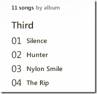
With 2.5 they’ve nicely reduced some of the UI element’s font sizes yet they’ve made others HUGE, such as the track number. The track number has all the visual focus while the more important information, the track title, is dwarfed and forgotten in the shadow of THE HUGE NUMBER. People don’t care about track numbers nearly as much these days yet somehow that gets all the focus? I’m completely baffled. Check it out:

Besides your eyes being assaulted by the huge numbers did you notice the bonus UI bug? That’s right, it says “11 songs by album”. Umm, no, sorry, this is actually being sorted by track number.
Besides the track number travesty they seem to have really cranked up the bold knob, everything is now very important. If you look at the properties tab for a song it’s like you just walked into a political debate, everything is really important and demands your attention, right now. It about sets my brain on fire. Also, it’s very curious that you can’t get to the metadata editing screen from the properties dialog. It seems someone with very bad eyesight that hasn’t been to the opthamologist in about a decade got put in charge of the UI team.
I saved the best for last… while I applaud the new metadata editing features there is a huge glaring problem with it, it doesn’t actually edit the real metadata. It may look lovely in your Zune but all your other applications, such as Winamp, Sonos, your mobile phone, iTunes, etc. will still see the same old busted metadata. Instead of correctly updating the underlying ID3 information it just makes some tweaks to the Zune database. Imagine when you get a new PC and you reinstall the Zune software, happily re-importing all your tracks only to discover all that painstaking metadata updating you did is gone. Or you want to show off all the album art you’ve added to all your tracks on your Sonos or Roku Soundbridge, only to see empty little lonely squares.
For this reason alone I’d suggest that you don’t use the Zune 2.5 metadata editing features. Don’t touch it, don’t look at it, don’t pass go. Don’t even think about it. If you want your metadata to really be updated then follow my suggestions here.
UPDATE: I was corrected on this issue by Zach Johnson, the Zune Client Development Lead. Seems the client uses a background thread to handle the actual writing of the ID3 tags. Of course this isn’t the most helpful if you want your changes to take place instantly but it’s better than I had thought. Also, while the ID3 data does eventually get updated the embedded album art doesn’t, which poses an issue for all your non-Zune applications.
The Rest
This is by and large a great update, bringing a lot of new features, fixing some old bugs and really polishing up the experience yet it seems for every bug or feature they fixed they managed to really bungle up some other ones. Metadata editing is very pretty and has a nice user experience, it’s just worthless. The UI has been polished, except for the spots where they just punted. Closer, you’re getting closer Zune team.
