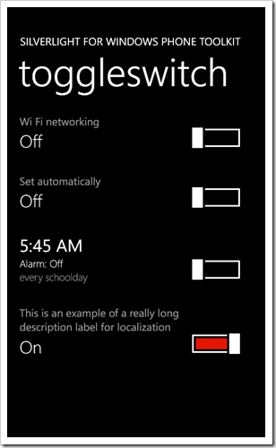
I’m going through the Windows Phone Toolkit bugs fixing some of the low hanging fruit and came across this bug where a ToggleSwitch with a long header is clipped. The proper Metro behavior is that it should wrap which is easy enough to do on a TextBlock. The rub though is that the Header is represented by a ContentControl, not a TextBlock.
ContentControl makes it easy to put whatever you’d like into the Header; images, other controls, buttons, etc. and is the standard Silverlight way of representing content. This is great for an open-ended environment like the Silverlight plug-in where each app has it’s own UI but on the phone you want as close to the Metro UI as you can get. In a perfect world (or just one with a time machine) we would have made Header a TextBlock with wrapping turned on but, well, we didn’t. We’re still debating if we should just make the switch and deal with the fall out but until then here is a super simple way to ensure your Header text wraps when it needs to:
<toolkit:ToggleSwitch Header="This is an example of a really long description label for localization">
    <toolkit:ToggleSwitch.HeaderTemplate>
        <DataTemplate>
            <TextBlock FontFamily="{StaticResource PhoneFontFamilyNormal}"
                        FontSize="{StaticResource PhoneFontSizeNormal}"
                        Foreground="{StaticResource PhoneSubtleBrush}"
                        TextWrapping="Wrap"
                        Text="{Binding}" />
        </DataTemplate>
    </toolkit:ToggleSwitch.HeaderTemplate>
</toolkit:ToggleSwitch>
Which gets you:
If you’re going to do any type of localization I recommend you make this change to all your ToggleSwitch controls.
